Tuesday, November 4, 2008

chairs

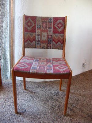
dining set, before

Last year we found an 8-piece dining room set (one table, seven chairs) at one of our favorite antique stores for a good price. We decided we liked the "mid-century modern" look for this house, so when we found this danish-style dining set, we bought it. The upholstery on the chairs was a Native American-style print which fit just fine with the house but wasn't something we really wanted. The Native American motif in furniture is cliche in the Southwest and, in my opinion, dishonors a rich culture by appropriating sacred symbols for the sake of trendy decor. In any case, we bought the dining set with the intention of reupholstering them someday in something funky and colorful.

danish chair, before


We searched far and wide for "funky and colorful" upholstering fabrics with little luck. I was surprised to discover that most of the fabrics available featured bland, muted colors, flowery prints, and basic stripes or checks. Online searches didn't yield much variety, either. The few fabrics I did like were way too expensive—about $20/yard.

Then last month, we discovered the textiles at IKEA and it wasn't long before I found a fabric I loved. When we got home, we had an upholsterer come over and give us a quote for upholstering the chairs. It would cost about $700, which was nearly twice as much as what we paid for the whole dining set! Thanks to the internet, we got online and watched some videos on do-it-yourself upholstering. Michael bought some foam and some tools for the job and set to work. So far, he's upholstered five of the seven chairs. I love the new look how well it fits with the house—colorful, funky, and modern.

danish chair, after

dining set, after (photo by Emma Graham)

Sunday, November 2, 2008

luna rica for sale

photo by Emma Graham

Luna Rica has been fully renovated. Unfortunately, I didn't get much of a chance to document the process, as every day I would come home from work and something new would have been done. Michael works hard, starting at 4:30 or 5:00 a.m. and working till about 6:00 p.m. I love coming home and finding some new surprise.

We put the house on the market last weekend and today will be the first open house. My friend Emma came over yesterday with her SLR camera and spent three hours photographing the house. She has a keen eye for detail and captured the house fabulously. I only wish we had had a few clouds in the sky to soften the light for her. She took over 400 photos which I will sort through and post soon.

photo by Emma Graham

In the meantime, here are some photos I took last weekend with my own little compact camera.

Monday, September 8, 2008

modest fame

Rumford fireplace in the kitchen


Michael and I were in California recently and had a chance to meet the architect Alex Riley at his home in Napa. We appreciated the opportunity to ask him some questions and learn more about our home's building process and history. He generously showed us around his home and studio and shared some photos of our house during the building process.

One of the questions Michael had was regarding the two fireplaces in the house. They are tall and shallow with a beehive-like design. Mr. Riley explained that they are Rumford fireplaces, which are the most efficient at heating up a room with minimal heat lost up the chimney and minimal smoking. They are beautiful fireplaces. The one in the kitchen reminds me of an 18th century kitchen hearth. Mr. Riley built a little nook in the kitchen where one can sit in the winter with a cup of coffee by the fire.

We also learned that our home was featured not once, but three times in Architectural Digest. The first article was published in March 1986. We have a copy of this issue, but I found the article online at the website of Roger Harned, the man credited for the interior design in the article. You can view the article here.

The second article, published in August 1986, featured the home on the cover of the Italian edition of Architectural Digest. Mr. Riley had a copy somewhere in his studio but was unable to find it while we were there. I've done some research to try to find that issue with little luck. I did find a copy had sold recently on Ebay Italy and e-mailed the vendor to find out if he can find another one for me.

The third article was published in a special edition "The AD 100 Architects" issue in 1991. Mr. Riley was named one of the top 100 architects in the world (alongside Frank Gehry and John Lautner, two other architects we admire) based on his design of our home. I found a copy of this issue on Ebay and we are eagerly waiting for it to show up in our mailbox.

Saturday, July 19, 2008

floor plan

Luna Rica Floor Plan (click image)


This is to give you an idea of the layout of the house. The concave part of the house faces south. What I love most about this floor plan is how everything is curved or rounded; there isn't a single square room in the house, including the closets. This is a design that Michael has attempted to create in the past but had trouble figuring out. One problem with circles and curves is that it's challenging to maximize the use of the space. It is difficult to furnish a round space and curves take up more room than squares.

The architect resolved this problem by custom-building curved countertops, cabinets, shelves, and desks. We didn't have much furniture when we moved in and fortunately, we didn't need to buy much. And since the space is so unique, we really can't buy just anything to furnish it. This supports our shared desire to maintain a minimalist aesthetic. We prefer to keep things simple and uncluttered, which the space demands.

Tuesday, May 27, 2008

critters

finch snacking on wildflower seeds


One of the greatest pleasures of living in the desert outside of the city is sharing one's home with a plethora of wildlife. Sometimes the wildlife is mildy annoying -- woodpeckers who drill into the wood planks that extend out over the patios and startle us awake at 5 a.m. -- and sometimes it's an outright hassle -- packrats who gnaw on the electrical wires of my hybrid, causing $200 worth of damage (and thank goodness only that!) But mostly it's an adventure in observing how the non-human animals on this planet get by on a daily basis. We are witnesses to mating rituals and the hunt (or battle) for food, alerts and lullabies, playful antics, and leisure time snoozing in the shade. Every time I look out the windows, I am startled by something moving just outside: a giant lizard on the wall doing "push-ups," a family of quail foraging for bugs and seeds, an owl perched on top of a saguaro at dusk calling to his mate, hummingbirds diving out of nowhere and hovering beside the lipstick bushes as they suck out the nectar. I love that our home has so many windows and it takes so little to be "out there" in nature, away from the noises of the city that keep most animals out of sight.

When I see critters outside doing what they do, I try to grab my little 4 megapixel camera and capture what I can from a safe distance. . .I don't want to scare them away. So far, the baby quail and their parents have successfully eluded my electronic eye. Following are some of the many shots I have taken of the critters around our home.


baby ground squirrels sticking close to home


wild bobcat stopping by for a drink


baby rattlesnake pretending to nap


cottontail bunny lounging on the patio awaiting his mojito


mule deer keeping the hedges trimmed in the driveway


frog warming himself by the patio light at night